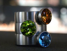
We started working on this project about 2 years ago. It began when we ran out of boxes. Laina began pouring over packaging catalogs and websites. She emailed friends for advice on shape and color. She punched numbers into the calculator, compared swatches, and argued with jay about hinges and foil stamping. There were many many sleepless nights and even more nights dreaming of the perfect ring box. And then...
the owner of Master Goldsmiths on Pearl Street decided to retire. Laina's box project suddenly veered in a whole new direction... namely the direction of the shelves. Box discussion became discussion of moving (house and business... that's a whole 'nother Oprah show) and of taking on the Master Goldsmiths history and somehow meshing their 30 year logo with our own. We made a slight change to our name, adding Master Goldsmiths as a describer of what we do... but were too busy with a moving sale and servicing our clients in the new Pearl Street location to put energy into a shiny new logo. We used up their leftover boxes (we're nothing if not practical) and called it good for the short term.
Now that we're finally feeling settled into our new digs and Hawk is back, we've had some time to address "the box/logo dilemma." To solve our logo anxiety we turned to Brad at Smokeproof Press here in Boulder. Along with an appreciation for his amazing work, Laina covets his incredible tomato garden and portable typewriter collection.
We are now the proud owners of this logo.Voila!
You like, yes? We definitely think we've avoided a "GAP" situation here. Thank you, Brad.
Other fun changes in the works: we have gorgeous boxes in production and some exciting renovations happening inside the store over the next few months... we'll keep you posted.
October 30, 2010
Subscribe to:
Post Comments (Atom)


love the new logo! it's perfectly sleek and stylish.
ReplyDelete